Moods & Media
Information

Information
“How do media consumption and digital social contact impact my daily mood?”
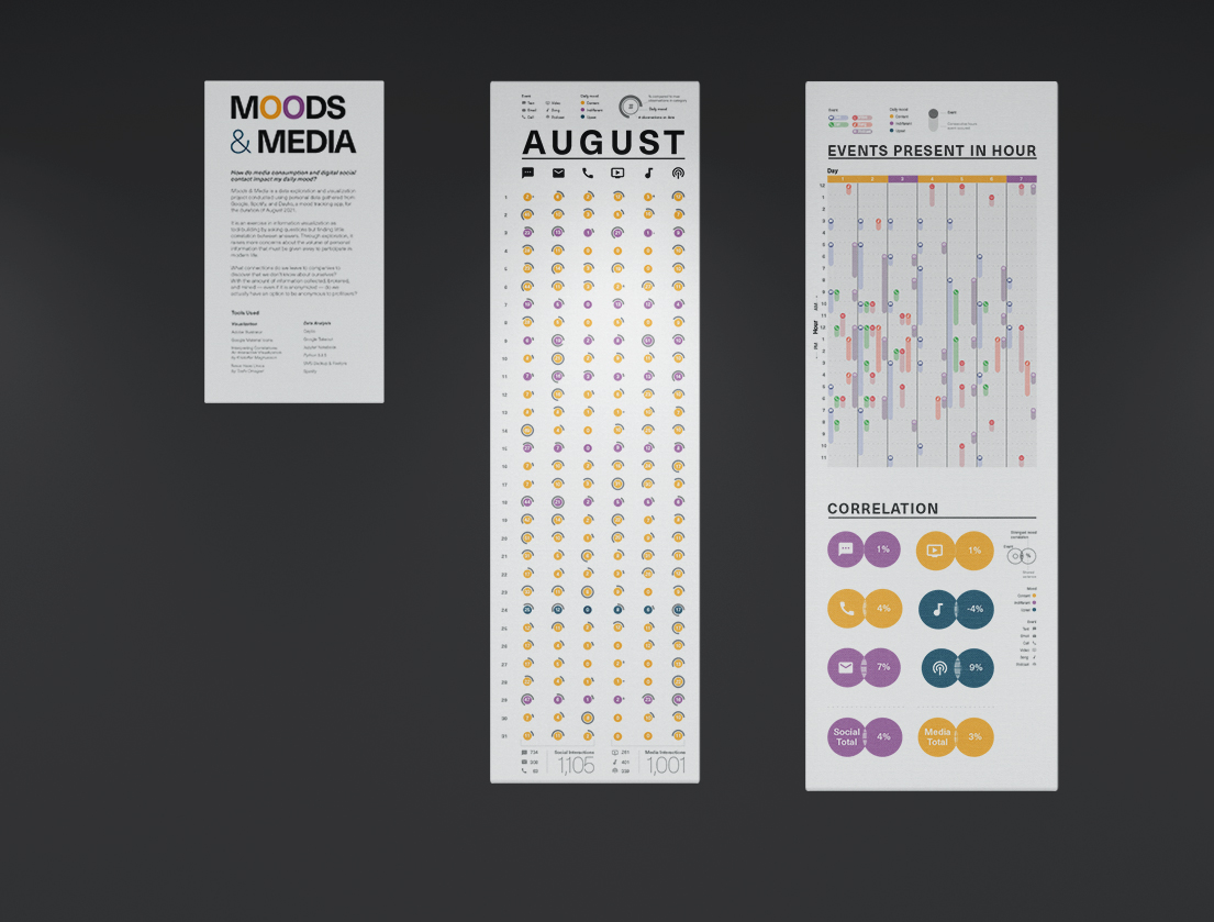
Mood & Media is a data exploration and visualization project conducted using personal data gathered from Google, Spotify, and Daylio, a mood tracking app, for the duration of August 2021. It is an exercise in information visualization as tool-building by asking questions but finding little correlation between answers. Through exploration, it raises more concerns about the volume of personal information that must be given away to participate in modern life.
What connections do we leave to companies to discover that we don’t know about ourselves? With the amount of information collected, brokered, and mined—even if it is anonymized—do we actually have an option to be anonymous to profiteers?
Moods & Media creates three separate tools for analyzing my data. The angles of approach are:

Graphic 1 exploring quantities.
Each chart synthesizes nearly six gigs of information in a unique way. The first presents a broad overview of every day of the month. Viewing the information like this allowed me to search for visual patterns over time across multiple variables.
To compare information across categories, the visualization provides a constant reference to the maximum observed for the month. This makes it easy to tell whether the individual node is high or low in comparison to the rest.
This graphic is intensionally dense with information. The viewer can enter it by noting categorical totals or by the visual pattern of colors. If the viewer is interested, there is a wealth of information to unpack and compare.
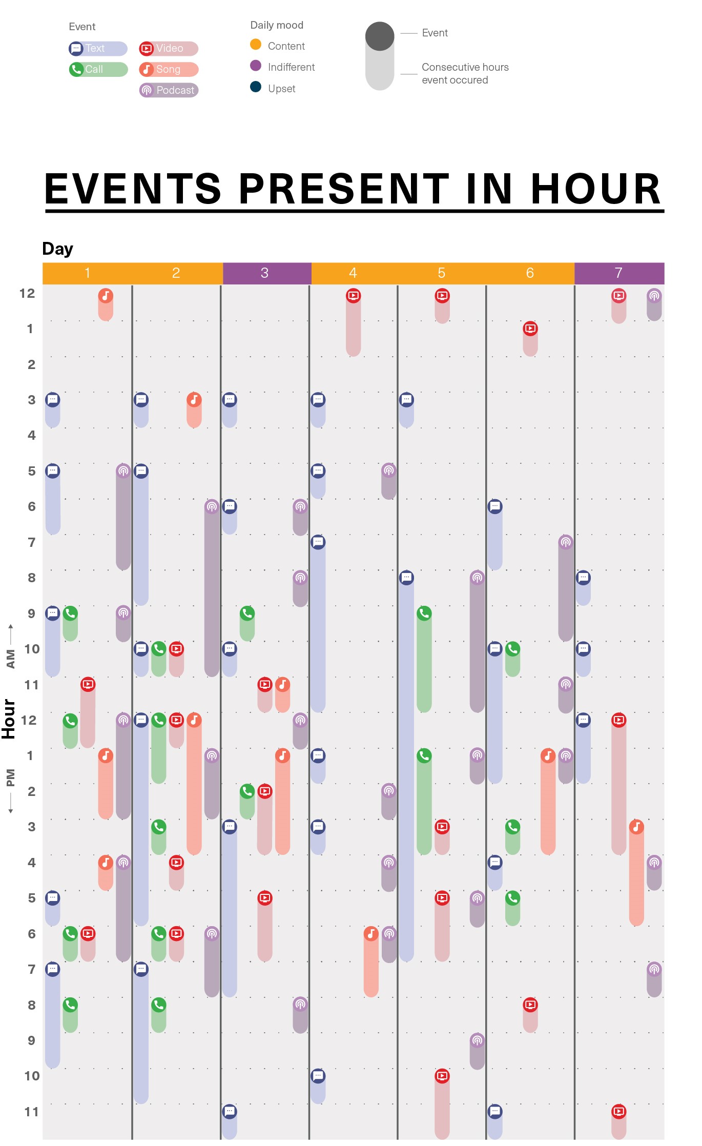
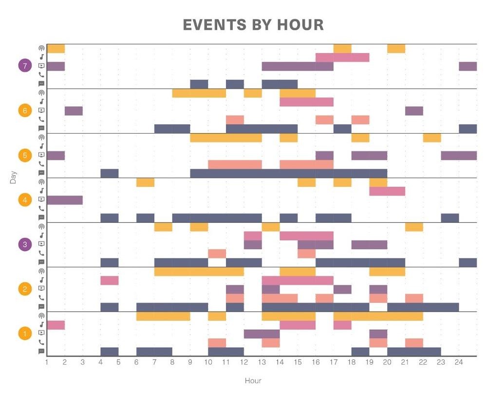
Media interactions by hour for first week of August.
The second graphic gives a micro view of media interactions across time by zooming in to dissect one week’s worth of activity. The second axis is freed to display each day by hour while the multicolumn indexes can track media events present in each hour.
Where the first graphic is more concerned with patterns in mood, this graphic displays continuity and patterns of interactions throughout the day.
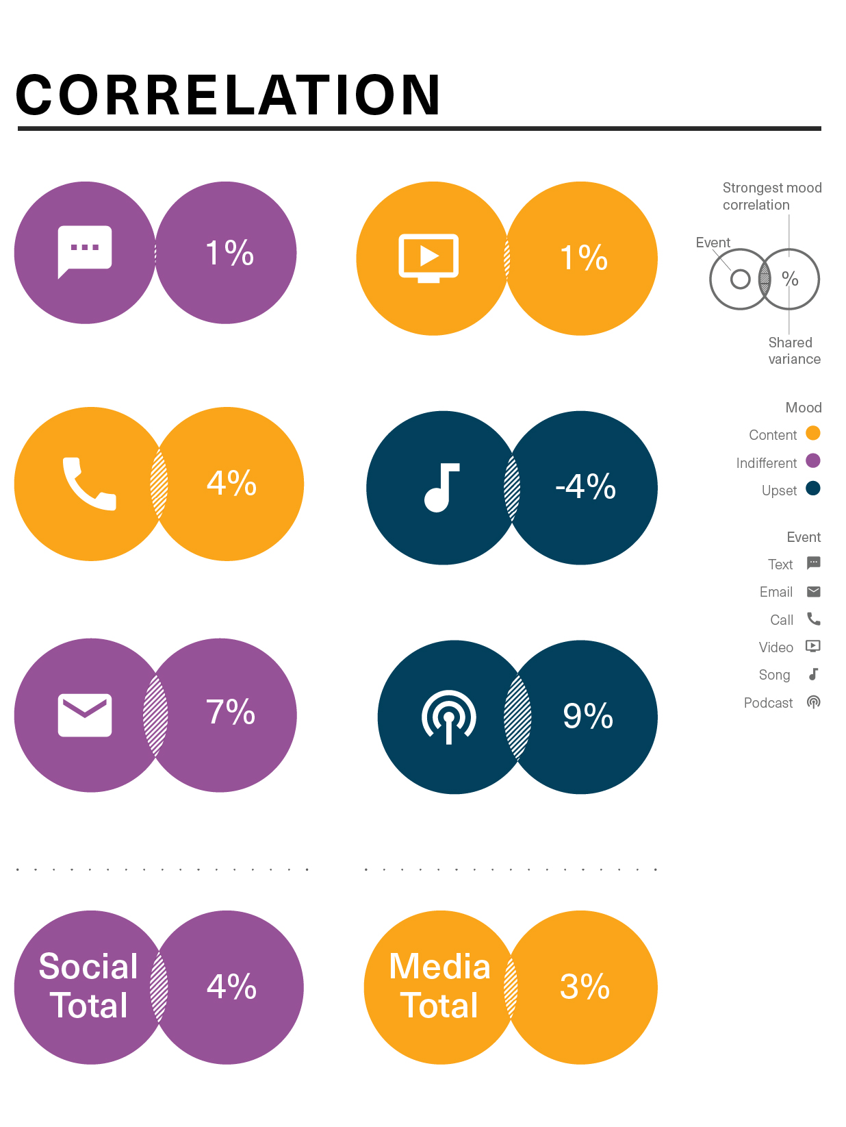
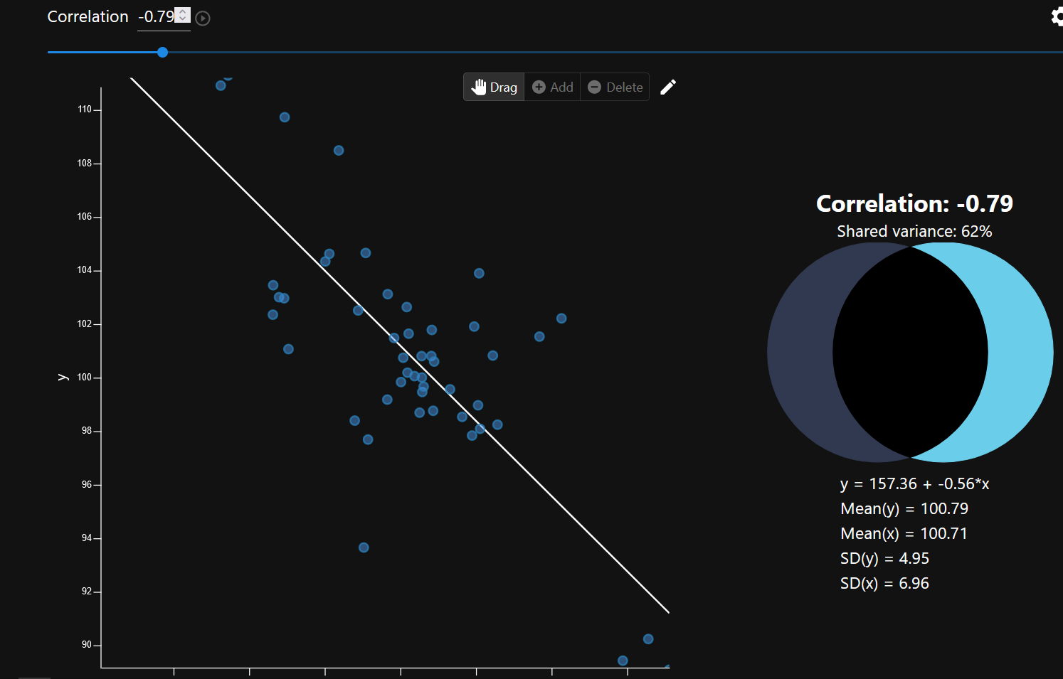
Strongest correlation for each type of media.
The final graphic summarizes my findings by displaying each media’s strongest mood correlation. None proved to be statistically significant, but the project did provide me with exercise in data analysis and creative ways to display complex information for interpretation.
To start this project, I submitted requests for copies of my personal information collected by Google, Spotify, and Daylio. This data had to be cleaned and standardized to compare. This was done programmatically using the Python programming language.
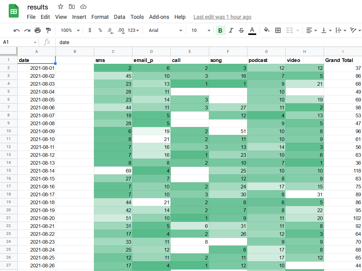
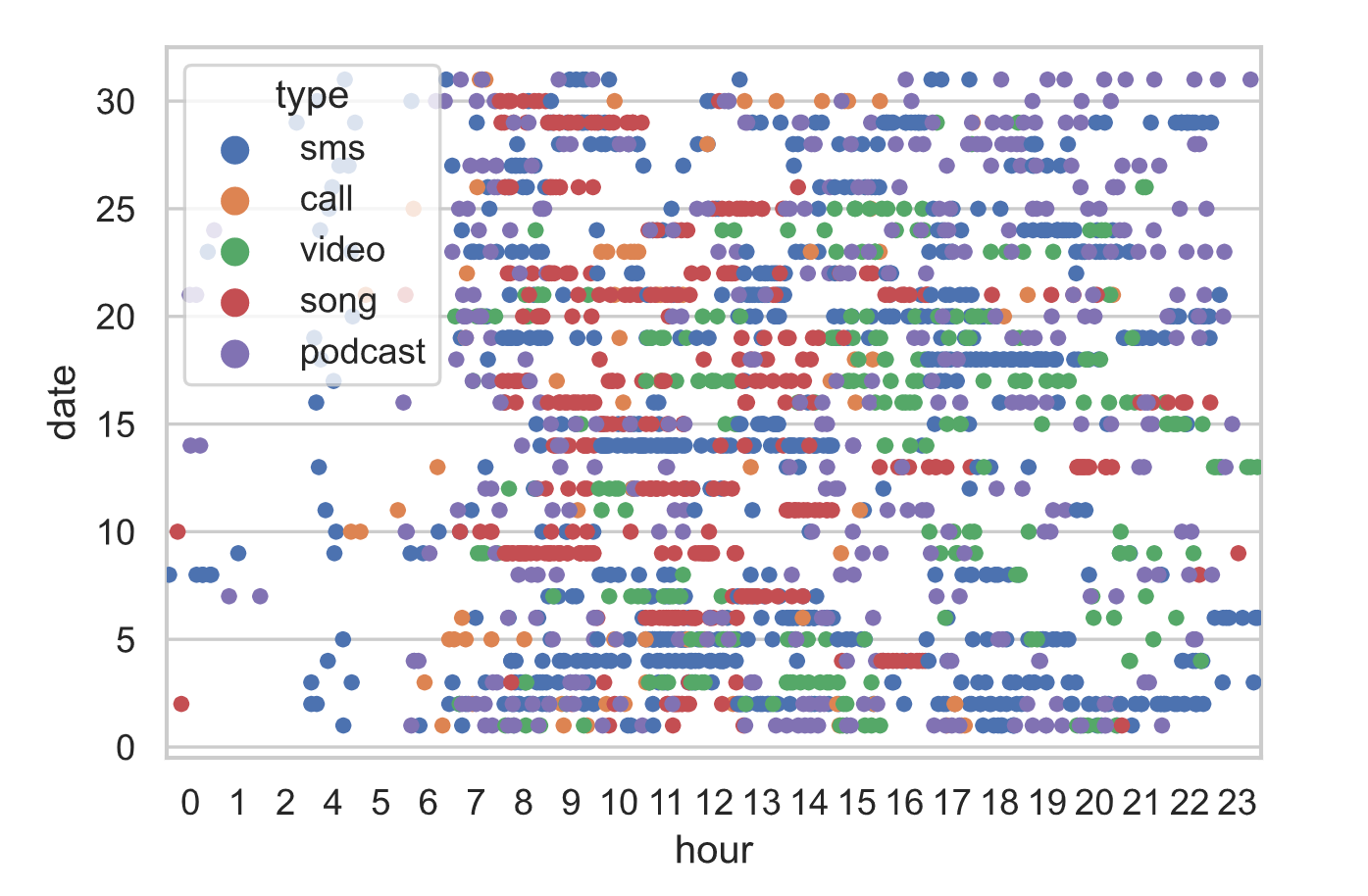
Synthesized data.
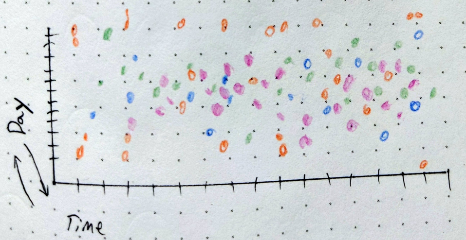
Once data was standardized into a single database, I began sketching ways to look at the data. This was best done by hand rather than relying on pure statistical inquiry or the cliches of standard charts.
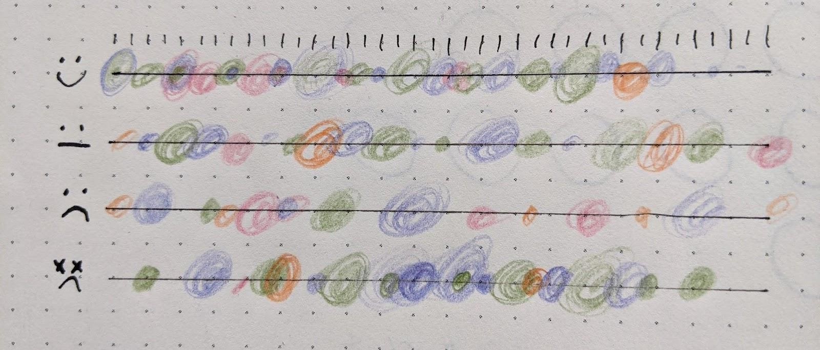
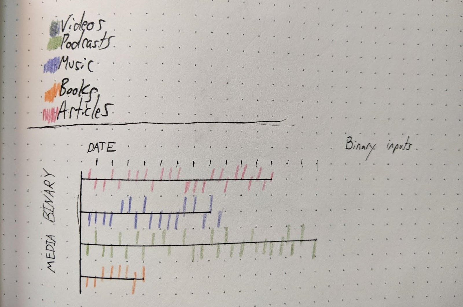
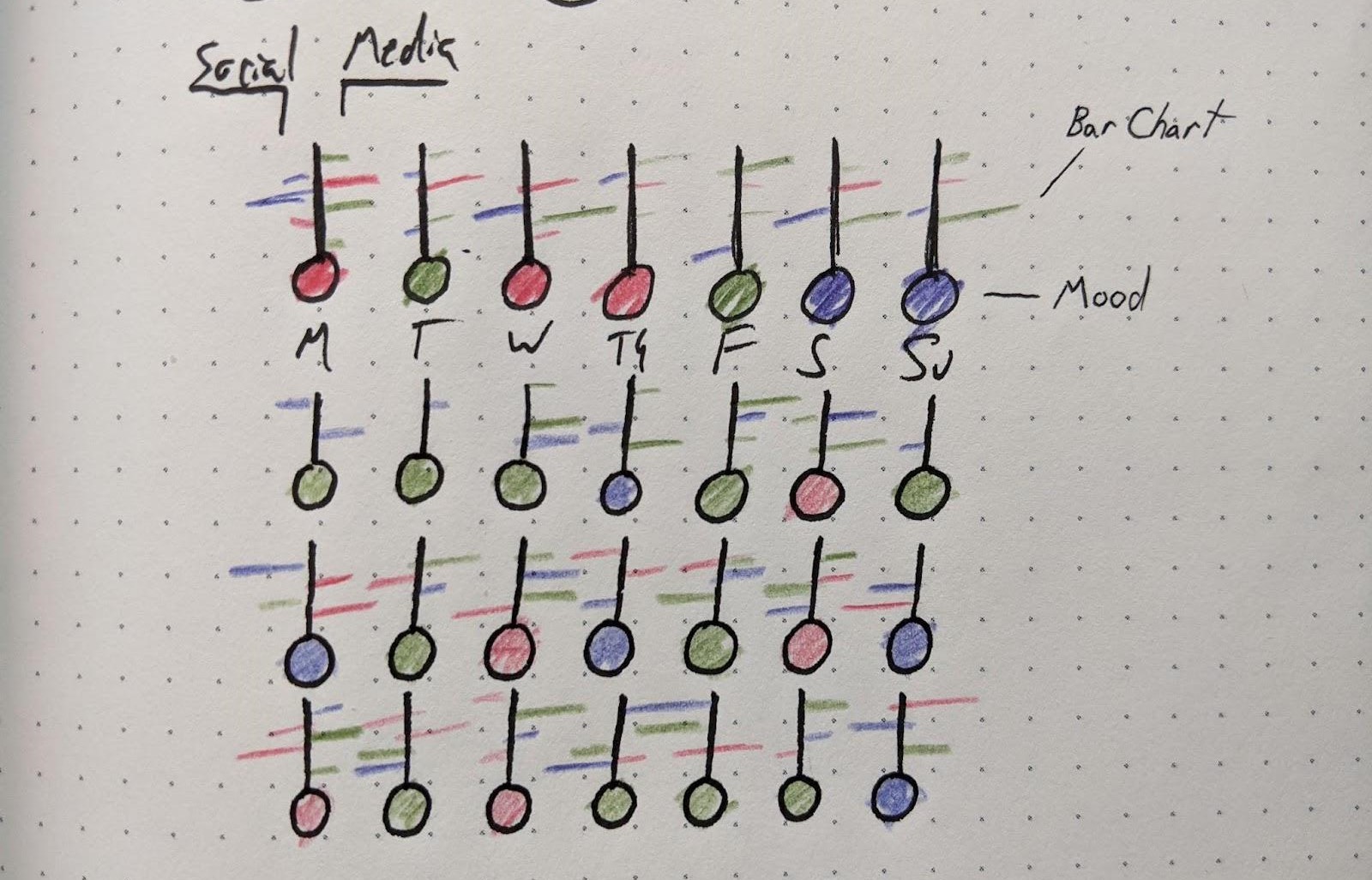
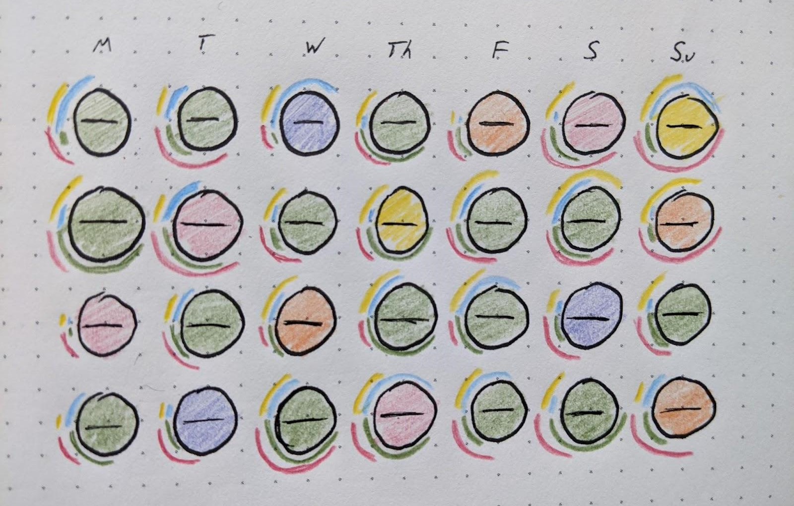
Small multiple sketches.
Through this method, I came up with the small multiples approach that was eventually used for the first chart.
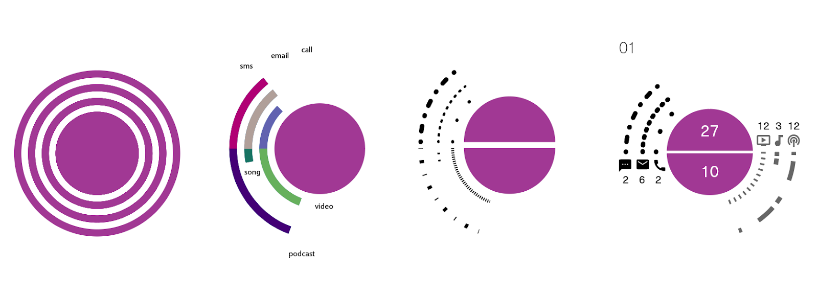
For the spatiotemporal analysis, visual pattern was needed to make sense of the information. I utilized a package called matplotlib and seaborn to make rudimentary charts of the information. Versions of these rudimentary charts could be exported and stylized in a more visually consistent and useful way.
